
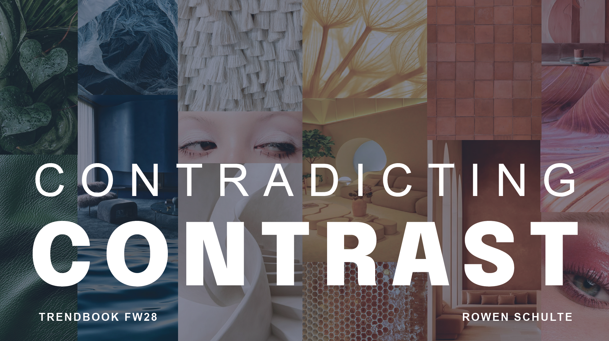

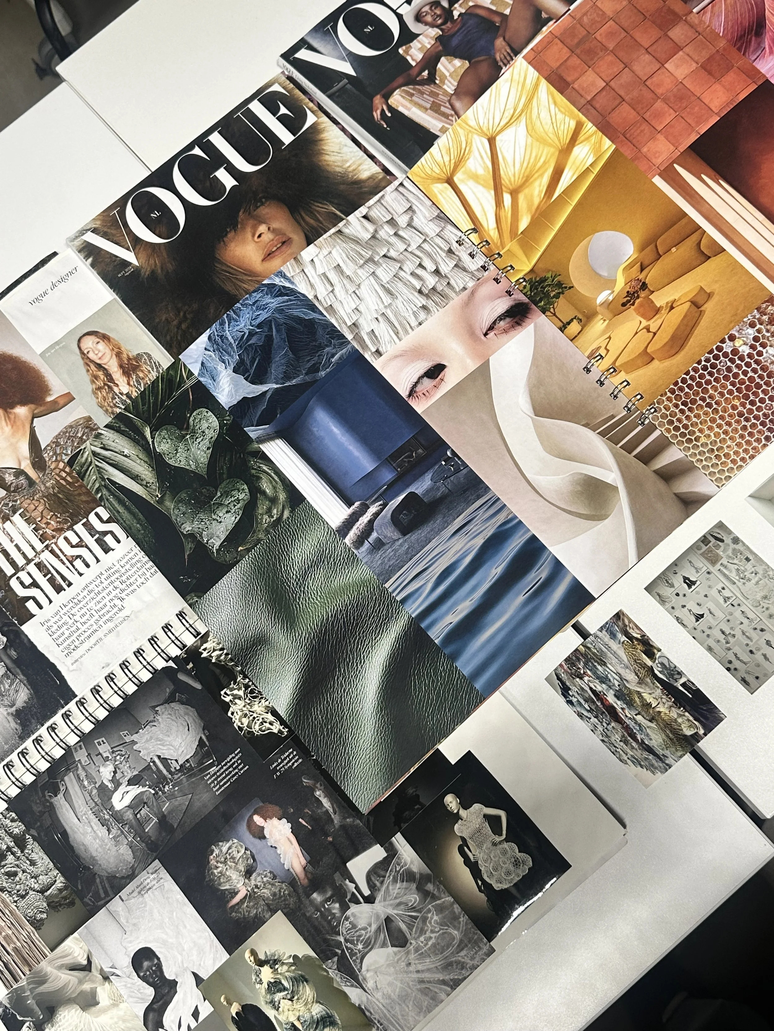
Contradicting Contrast is a trendbook inspired by the growing polarisation in society. As differences between people, opinions and perspectives become increasingly visible, a stronger need for connection, balance and common ground emerges.
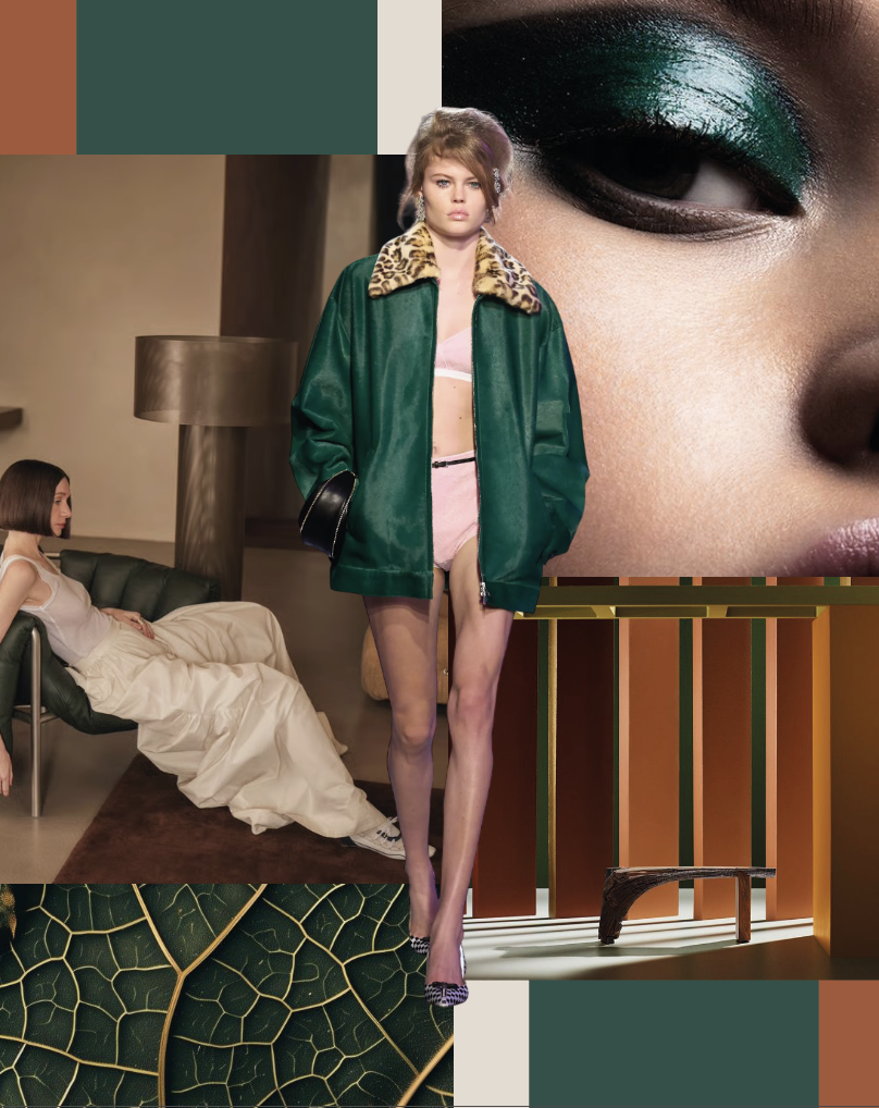
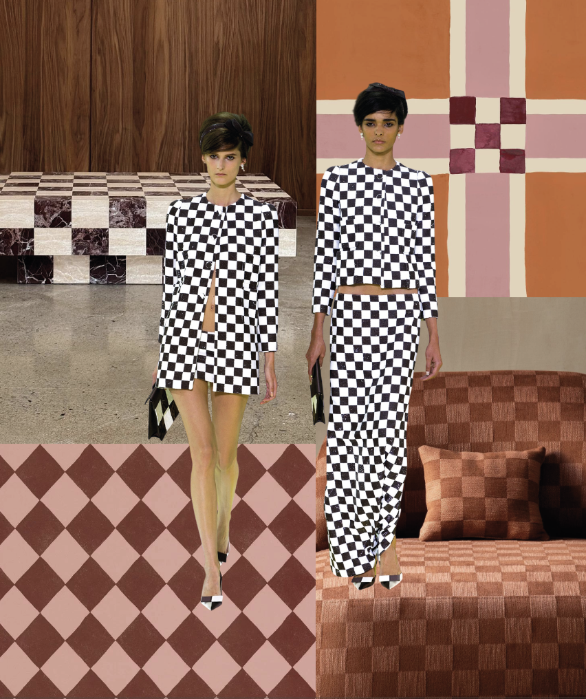
For FW28, I explored how this tension between opposites can translate into a visual language. Instead of choosing one side, Contradicting Contrast brings opposing elements together: softness and strength, organic and structured, warm and cool.
Through colour, material, shape and pattern, these contrasts become a way of expressing the complexity of our time. The result is a trend that shows how opposing forces can coexist, creating something that feels both contradictory and connected.
+31653144216
rowenschulte05@gmail.com